So, let's check it out and have some fun. Just enter the following query into Google:
msl_ib_ns filetype:txt site:sealevel.colorado.edu
The first entry should be the relevant file. If you click on it, you'll get the most recent data. If you click on Google's cache entry (probably available for only some days; keep a copy...), you'll get the older data (#version_2010_rel5). Importing into a worksheet and plotting a linear regression is quite easy. Getting a graph for the evolution of the linear regression values over time is also not that difficult, using the SLOPE() function. The results are the following two graphs:
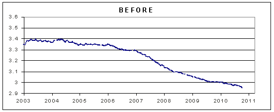 |  |
Notice that the rate of rise has gone up, due to the Colorado correction, but is going down. And it's going down faster! When they last plotted the data, the value for cycle 2010.7415 was 2.956158611, just enough to round it to 3.0, when considering one decimal place, as they do. Now, they have figured out the trick to leave the rate of rise above 3.1, at least for some months...
UPDATE: Following some doubts, the graphs above reflect the trend since satellite data begins, in 1992. For example, the value for 2003 represents the linear regression trend between 1992 and 2003, while the value for 2011 represents the linear regression trend between 1992 and 2011.

